2024 has been an intensively distinct year, possibly in everyone’s lives. Nonetheless, it has witnessed some of the best Web design trends as compared to the previous years. With more than half of the year already gone, we think it is the perfect time to bring to you some best web design trends in 2024.
We hope they would be beneficial for you. So let’s get started!
1. Dark mode

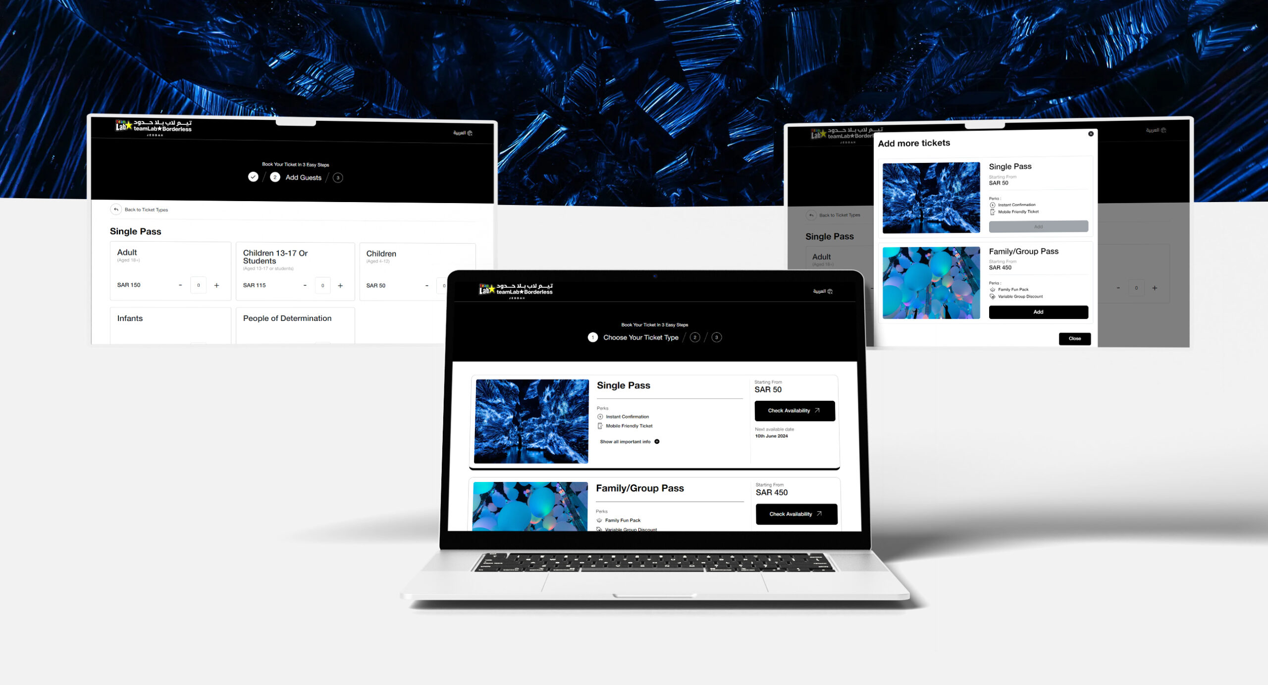
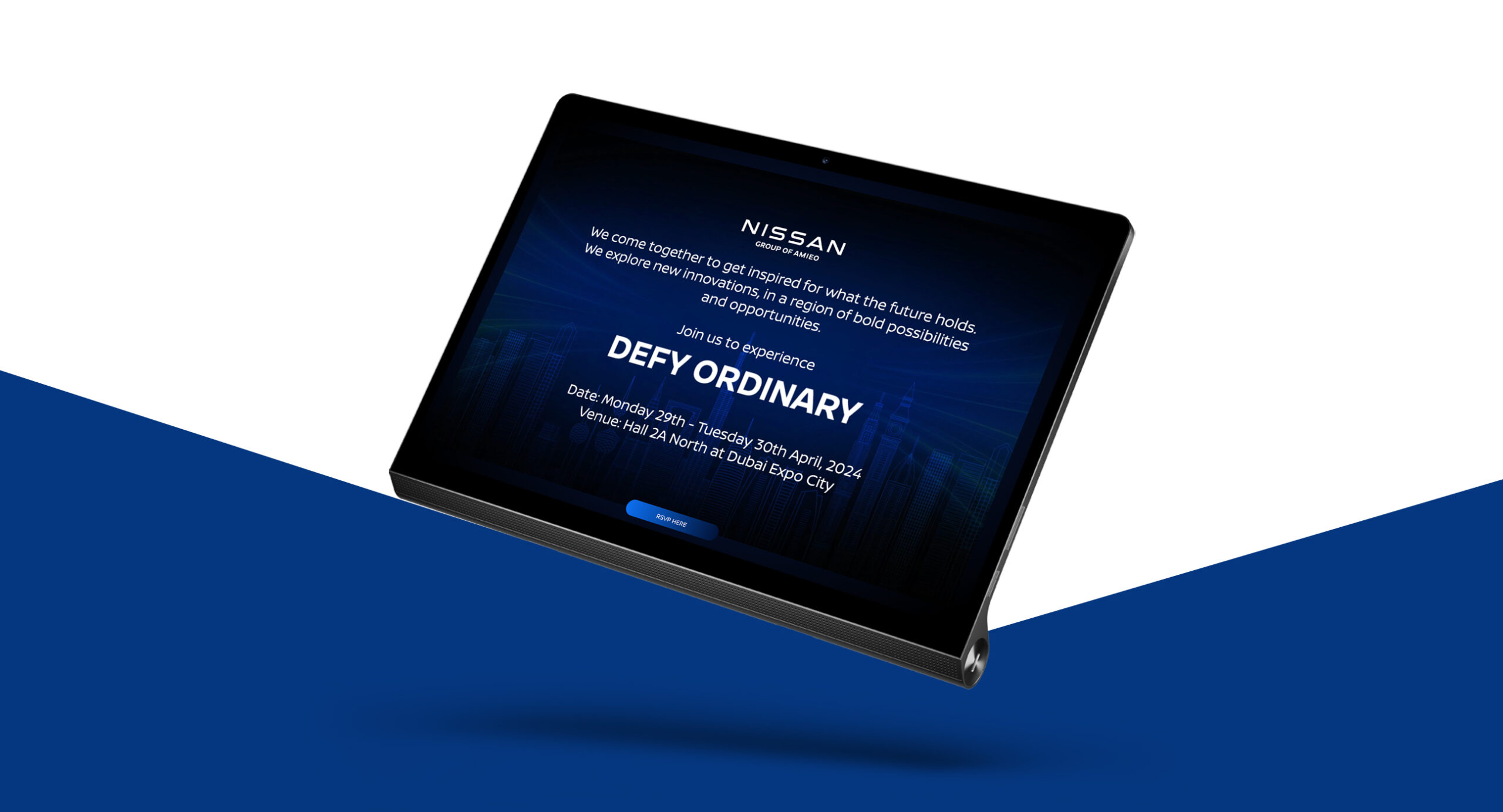
You might have noticed that almost every app and website now comes with this feature. From YouTube to Gmail, users seem to love this simple yet aesthetically appealing design. The dark mode also reduces eye strain and conserve the battery power of the device. Earlier intended to be used in the night time, people are opting for it even if the sun is shining bright outside.
2. Hand drawing

For people wishing to add more character to their websites, hand-drawn elements can be a good option. They not only add an oozing personality to the website but also make it stand out from the existing competitors. Imperfect hand-drawn elements can inject humanity into the otherwise impersonal websites.
3. Graphic with Pictures
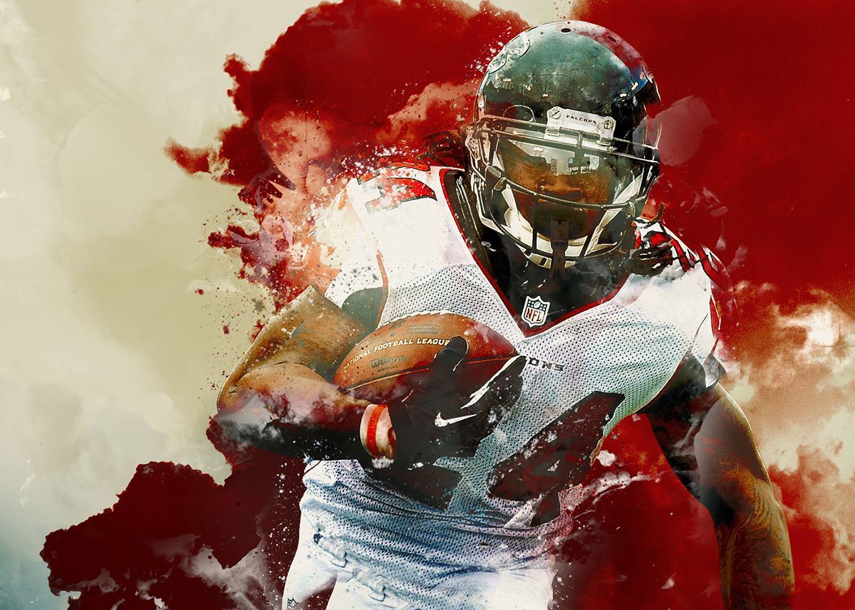
Image Source: Pantone.com
The creativity employed in this design trend is simply remarkable. Overlapping graphics on top of real photographs could instill life into most bland of the elements. Employing this design trend on a project where the elements are complicated or abstract, you could provide a distinct identity to the brand altogether.
4. Minimalistic Design

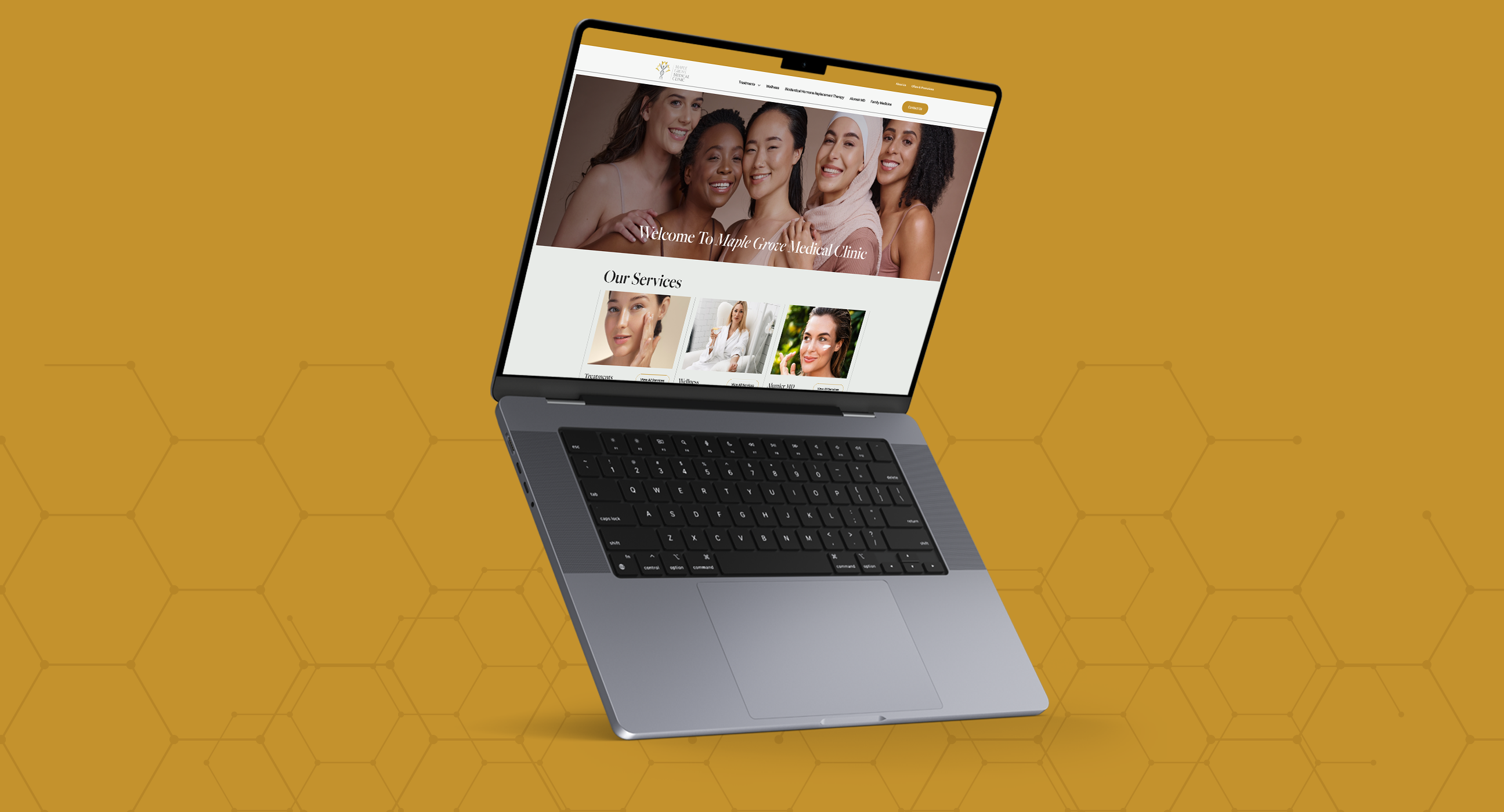
No matter if it’s 2024 or 2030, we’re sure minimalism would always be in trend as it has carved a niche for itself. Used with bold, bright colors and heavy fonts you could enhance the aesthetics of any website. It is beneficial especially in projects where the message needs to be communicated clearly.
5. 3D Design
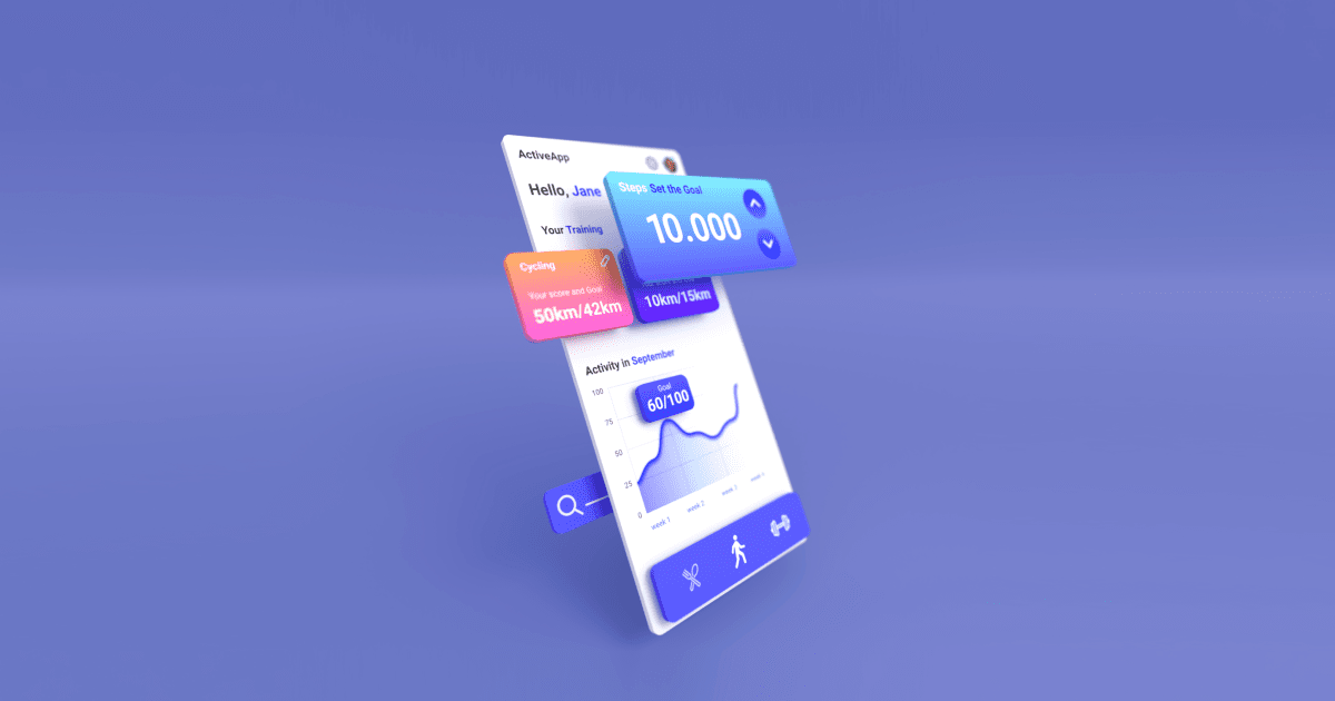
If you aim to provide realism to your design, nothing’s better than opting for 3D graphics. As 3D rendering required high device processing power, it laid its foot only in games and selective websites. However, as now almost every device is capable of rendering 3D visuals efficiently, it’s being used increasingly by more website designers.
6. Bright Colors
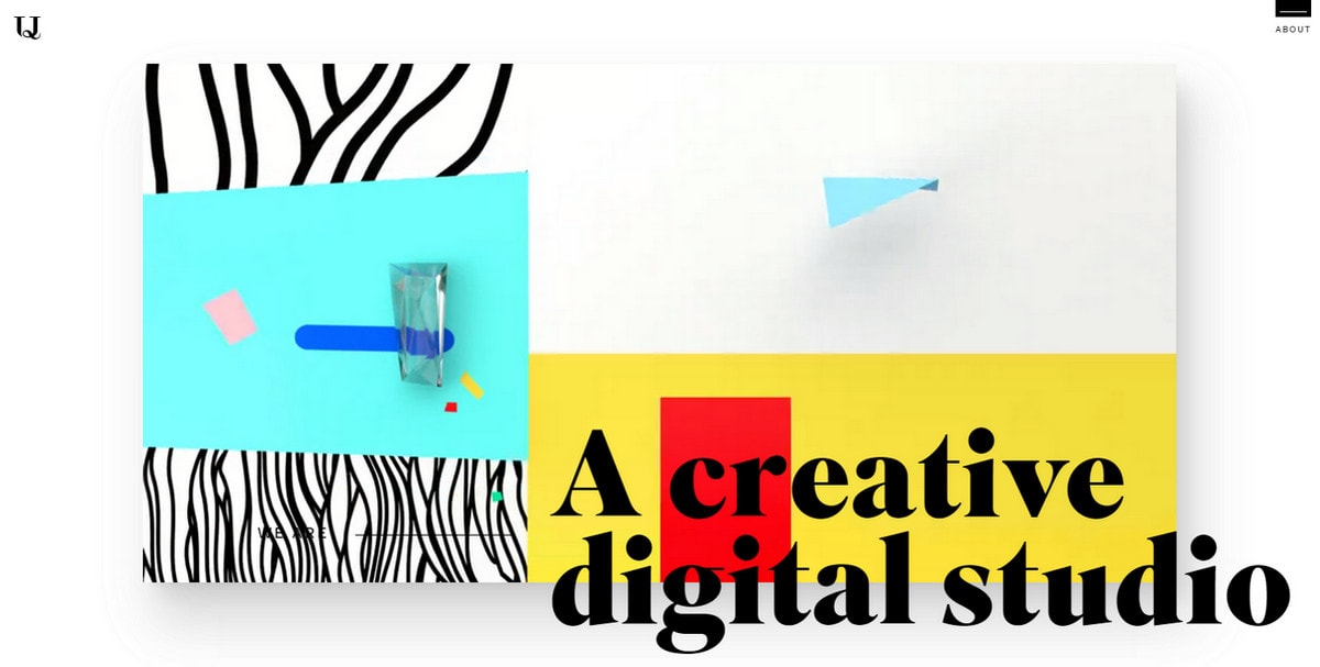
Image Source: violencemedia.com
Bright colors are effective in catching attention which explains the reason for their onset especially in the eCommerce industry. They provide a distinct experience to the user making the website more memorable. Just make sure if your brand personality goes all well with bright colors or with subtle ones.
7. Illustrations
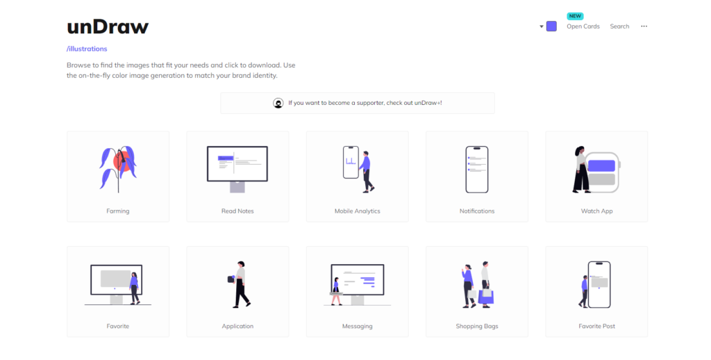
While stock photography is easy, it is gradually failing to catch & retain people’s attention in many places. This is why many website owners are opting for illustrations for their website instead of choosing stock photos. While it is a significantly costly affair, the benefits outweigh the costs by a great margin.
8. Unique fonts

There are thousands of fonts available on the internet. And surely each of them has its own personality. In recent times, web designers are painstakingly finding fonts that align with the brand’s personality, creating a distinct identity altogether. Just make sure the fonts are legible and don’t compromise on the message being conveyed.
9. Data Visualization
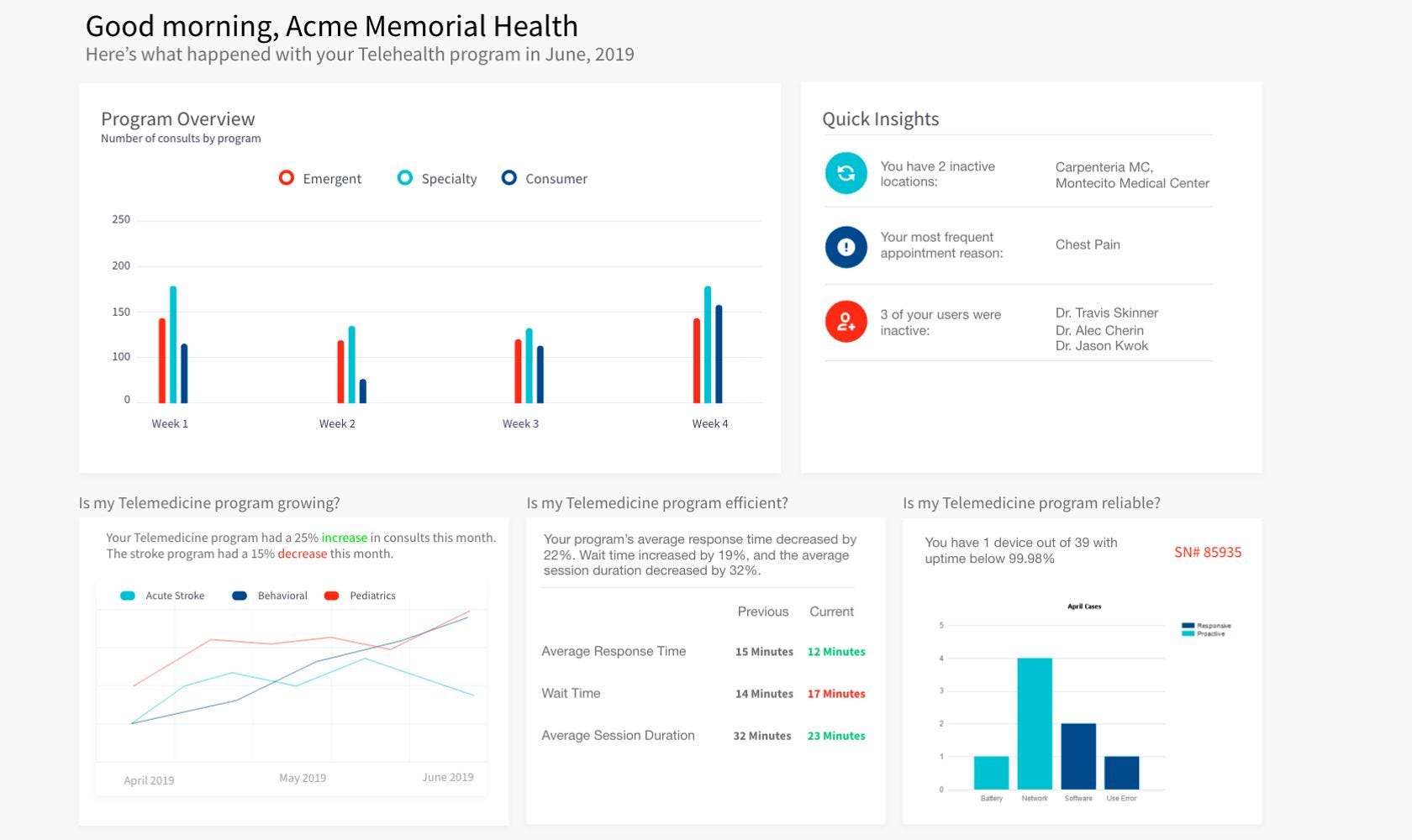
The Internet has made us more aware of the world around us. This has in turn piqued our curiosity where we seek to know the intricacies of things. This is why nowadays brands are utilizing data to communicate their story and incorporating data visualization into their design.
10. Voice Capable Interfaces
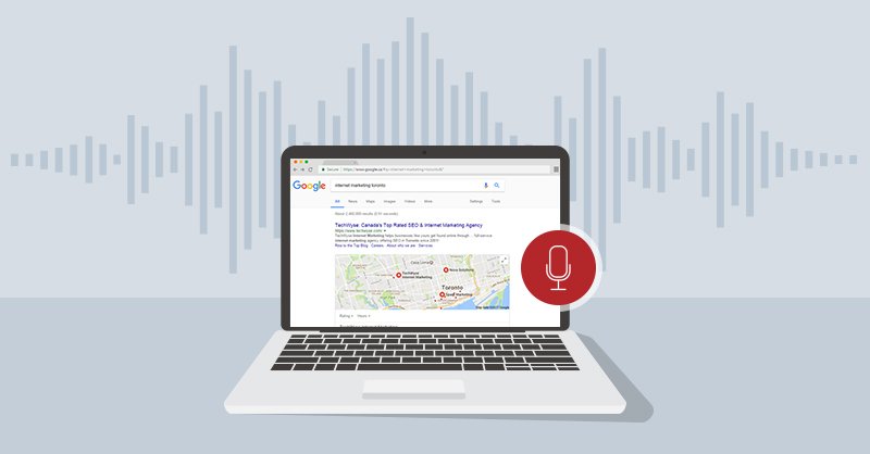
While almost no one admires auto-play sounds on the websites. Nowadays, the ‘sound’ is being used quite creatively to capture and retain user’s attention. Numerous research points out the decreasing human attention span and this is why audio and video could be a great way to find a creative way out.
11. Gradients
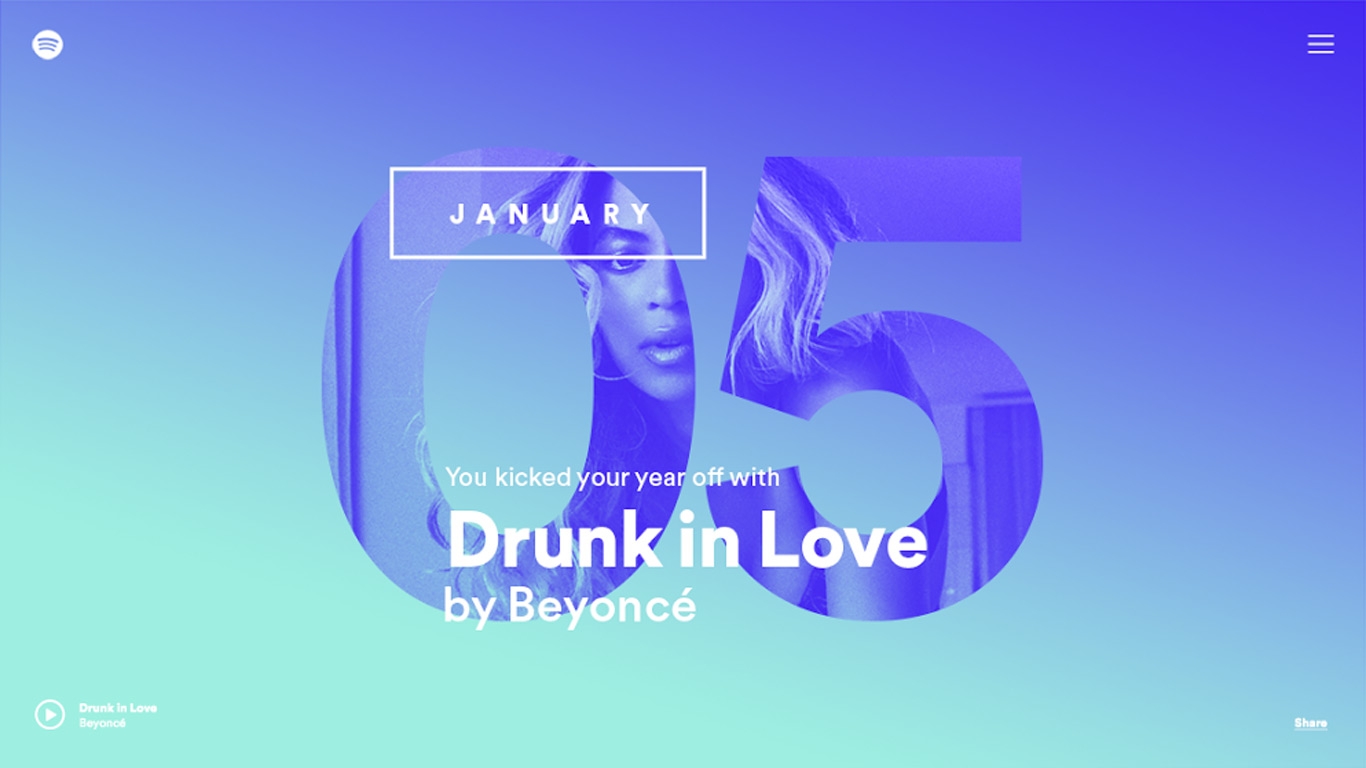
Gradients have gradually started to replace the flat colors. Coupled with minimalistic design, they can go a long way in eliminating boring flat colors and making the website visually interesting.
12. Bold Fonts
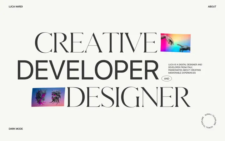
Bold fonts catch the attention easily. Used in headlines they can put more visual weight and convey the intended message effectively. It is indeed difficult to avoid something written in bold and this is why we suggest you incorporate this design trend. In addition to providing clarity, bold fonts also give the website a modern and contemporary feel.
13. Solid frames of white spaces
Fullscreen images and parallax scrolling have occupied the market for a long time. However, now designers are leaning towards using lots and lots of white spaces. This technique is especially beneficial for websites that host a large amount of content and seek to offer. Coupled with minimalistic designs, it can be a game-changer.
14. Scroll-Driven websites
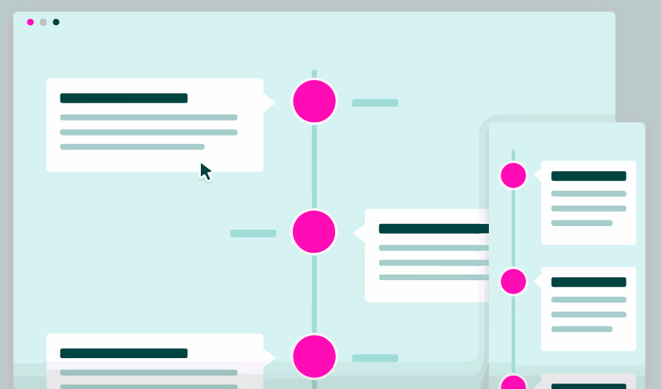
If you wish to show contextually relevant information to your viewers, scroll-driven websites could be a great alternative. They make the website interactive and generate content as the user scrolls down the website.
15. Chatbots
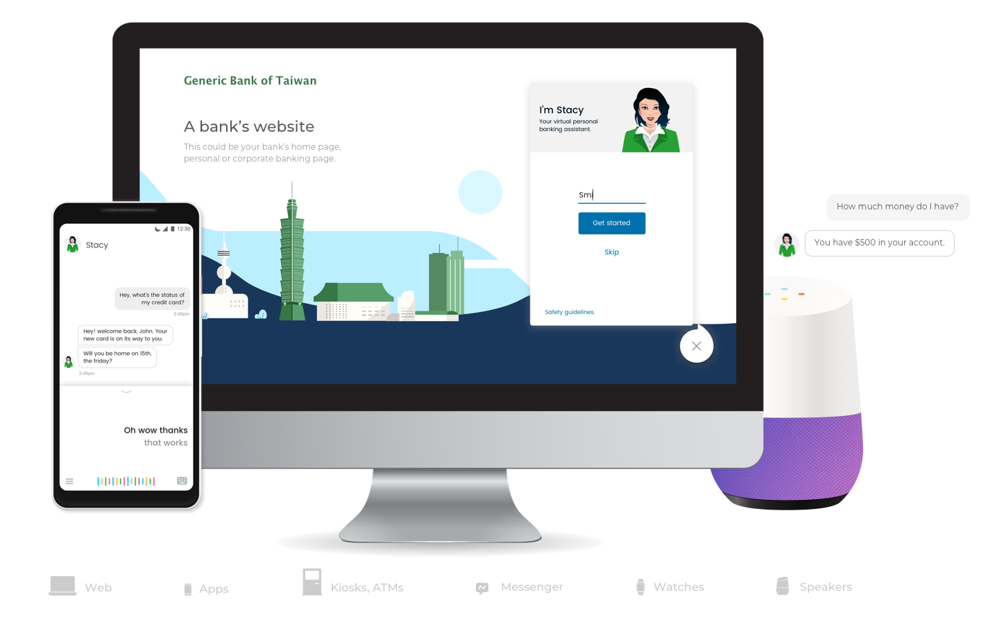
This point is distinct from the other we have mentioned. So while Chatbots have existed for a long time, they are now being made more smart and relevant for users. They are highly relevant for business websites and incorporating them generally leads to higher customer satisfaction.
16. Breaking Typography rules
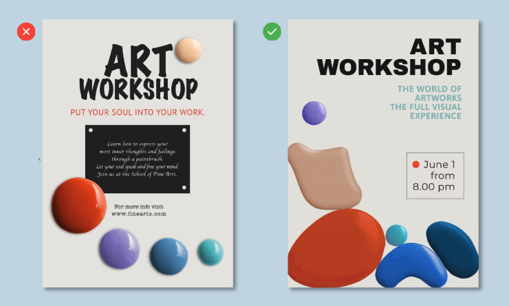
Treating words and letters as art could be beneficial in creating a distinct identity of your website. You could break the traditional typography rules and experiment with line spacing, breaks, fonts, and text designs to make users notice your website.
17. Emotional Designs
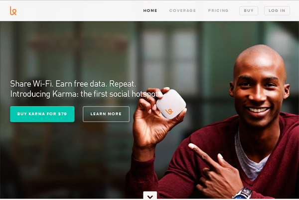
Adding a human element in design helps in communicating and associating better with the users. You can use emoticons or artificial faces in several elements of the website.
18. Outlined fonts
This is the third point in this article concerning fonts. And yes, fonts are indispensable for great design. You can use outlined fonts, that is, the outline of the letters instead of using the whole body and you’ll see the addition it does in enhancing the aesthetic appeal of your site.
19. Hamburger Menus
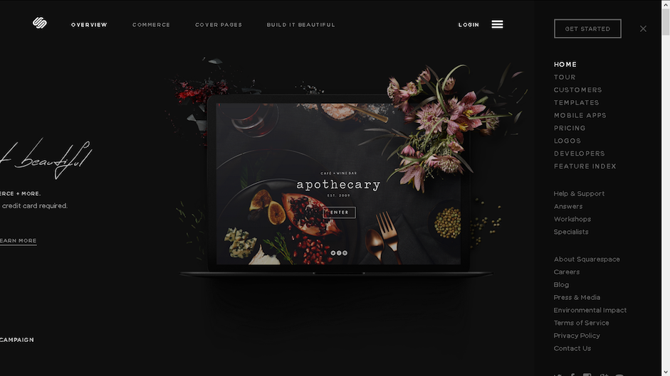
Ever deliberated about those 3-4 horizontal lines on top of the webpage or an app? These are called Hamburger menus which open up main menu when you click on them. Nowadays, these are increasingly being used in websites to keep them clean and clutter-free.
20. Rounced Edges
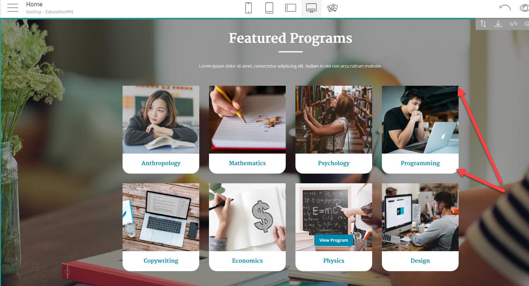
Usage of rounded edges is not only prominent in logos, but the employability of this trend has seen an upward trajectory even in websites. Now every website is inclined towards making the windows, buttons, and containers rounder in contrast to the sharp design which used to be adopted earlier.
Parting Notes
We hope this well-researched article gave you ideas for your future projects. Web design trends change constantly and above were some of the best web design trends in 2022. Connect with GTECH as we offer various web design services that will help you discover and utilize the potential of your website.
Related Post
Publications, Insights & News from GTECH

