Have you ever seen a particular UI UX design service company website or any site that instantly hooks you upon seeing it for the first time? Maybe it must be the design, the copy, colour but I would like to call it the hero section website design. This initial part is what makes potential customers stay longer and is a very important section of any website.
Being the first thing customers see, every professional business website must have a well-executed hero section website design but how to create one that excites visitors and increases conversion rate? If you are stuck at that point, then I have the answer to that in the form of a set of tips to create best hero section for website which will be examined later on.
One thing I can assure you is that by the end, you’ll get an idea about how to design a hero section, communicate your brand message succinctly and encourage visitors to learn more about your products or services. Let’s get started.
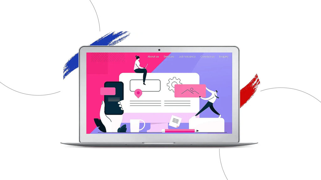
How to create best hero section and its elements
Before learning the tips to create best hero section for website, what is hero design all about? How does it play a crucial role in making or breaking your business? Let’s get to know that first. The hero section is the top area on the homepage of the website. In simple words, this is the first thing you see when the website loads up. If this portion doesn’t get to keep the customer’s attention, they are more likely to leave. Therefore, hero section website design is something that shouldn’t be messed up.
Before deciding on how to design a hero section, three major elements must be included in every hero section. The first one is a compelling headline, and writing such one might be the hardest part, why? The reason is that your brand message, and what you do must be precisely conveyed in one statement. When writing the headline, it would be wise to address the customers directly by using the words ‘you’, your’ rather than ‘we, my and ours’.
The second one is a sub-headline which is one or two sentences placed below the main headline. The purpose of this is to give more context to the heading. Adding in personality and emotion is a powerful way to connect with your reader. The third element is CTA or Call To Action. When customers visit the hero section website design and become interested, they must be navigated to the conversion funnel. This is where placing an appropriate CTA allows them to take action.
Jaw-dropping tips to create best hero section for website
Now that you know what a hero section is, it is time to examine the various hero section best practices. The hero section website design tips explained below are proven strategies that have worked for several brands over the years.
Clarity over confusion
When making the best hero section design, the last thing you want is to confuse your customers and lose them for good. This is why your hero section should stand out by making it easy for your audience to understand and take action. As the attention span of customers is mere seconds, it is important to make them feel they have found what they’re looking for. This makes it one of the must-try hero section website design tips ever.
Invest in relevant images/videos
Point number two on how to improve hero section is making sure the area contains not only text but also visually stunning images and videos that resonate with your brand. Adding high-quality images is one of the effective tips to create best hero section for website and grab customers’ attention. Moreover, the chosen files must support your brand’s vision.
Favour the left side
Still, figuring out how to design a hero section? Note this tip. It is said that when a user loads a website, they focus about 80% of the time on the left half of the page and 20% on the right half. What does this mean? This means that your hero section must be placed on the left side and put the other relevant information on the right.
Incorporate eye-catching colours
Colours do have a strong effect on our lives, isn’t it? The same applies to websites too. When planning on how to design a hero section, try incorporating hues that represent your brand. For eg, if blue is the dominant colour in your brand, add that to your hero section. Adding additional colours is also good but make sure there isn’t too much as this can distract your customers.
Keep it simple & minimal
Another tip on how to create best hero section? At least keep your homepage minimal. You might have seen certain websites where the design and contents are just minimal and precise to the point. Even though you might have a big brand message to convey, it is important to do it without making it overcrowded. Too much text and designs overwhelm customers to the point they leave.
Make It Responsive
Best practice to create hero section? this tip is pretty obvious as this is the era of smart devices where it’s important to make your website look good on all screen types. Therefore, as you brainstorm ideas on how to create best hero section for your brand website, just ensure that it has a responsive design for mobile, desktop and tablet as well.
Communicate using legible fonts
Have you seen the fonts used in the websites of MNCs like Apple, Google, etc? Not only do they look good but they are also readable. This is something you must follow when making the best hero section design for your brand else what’s the point of designing one if it is difficult for customers to read? Just pay attention.
Pay attention to a good layout
Having a good design layout for your website is one of the key hero section best practices to follow. A well-designed hero section will have a clear structure and visually be striking. This allows customers to quickly find and navigate the various web pages.
Don’t ignore on-page SEO
Tip number 9 on how to improve hero section, try to include the target keywords in the H1 section of your home page. By doing this, Google understands what your brand offers and effectively ranks your website in the search results.
Use a clear call-to-action button
As explained earlier CTA is an important element of the hero section. The purpose of the call to action is to encourage customers to take action on your website. Therefore, before deciding how to create best hero section, make sure that the CTA button is visible with an appropriate message and that it stands out from the rest of the colour palette applied.
Winding up
By now you must have an idea of what should be in hero section of website and the three elements that must be included at all costs. The tips mentioned above can be used according to your liking but, if you are still wondering how to design website hero sections, approaching the services of the best web design agency in Dubai is a good idea.
Related Post
Publications, Insights & News from GTECH


