
Mobile-First Web Design: The Key To Business Growth In 2025

Mobile web design is becoming popular as many access information using smartphones and tablets. So, it is high time to consider mobile-friendly website development before anything else to help your business thrive. You neither want to lose your potential customers nor miss any chance of engagement and conversions. Despite the vertical, size, and niche of your business, you need a mobile-first web design for certain. In this blog, you will learn why a mobile-first web designing approach benefits your business.

The relevance of mobile-friendly website development
In our technological world, the pace is at breakneck speed and your target customers want services, products, or information immediately. So, the adoption of mobile-first indexing is a necessity. Almost all of your target customers have access to smartphones and many people are utilizing it to access all kinds of information. Smartphone has a small screen, and within that screen size providing maximum user experience is not always easy unless you adapt to mobile web design. Fast loading speed, responsiveness in web design, and 100% user experience are the primary features of any mobile-first web design.
Strategies for Mobile Web Design
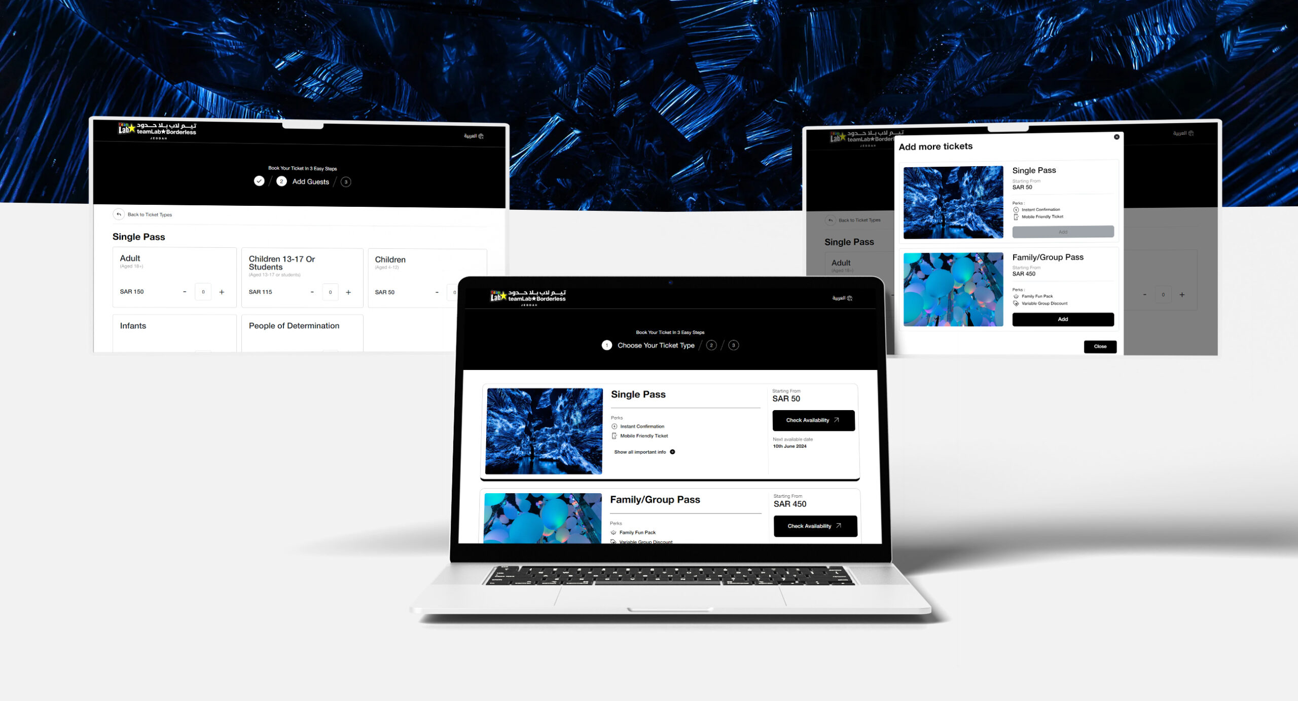
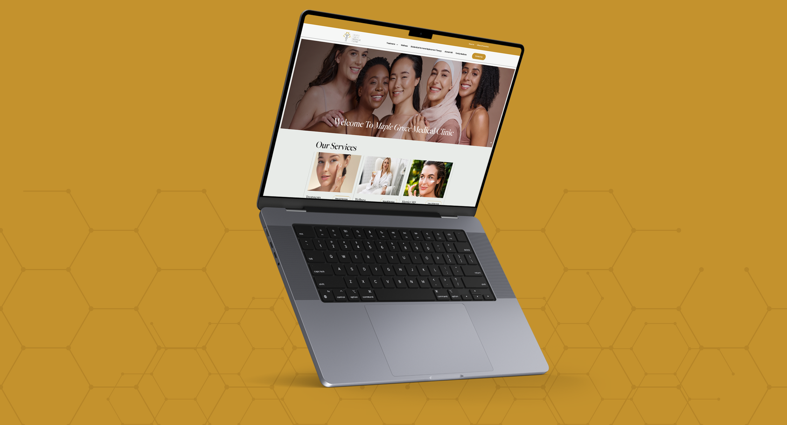
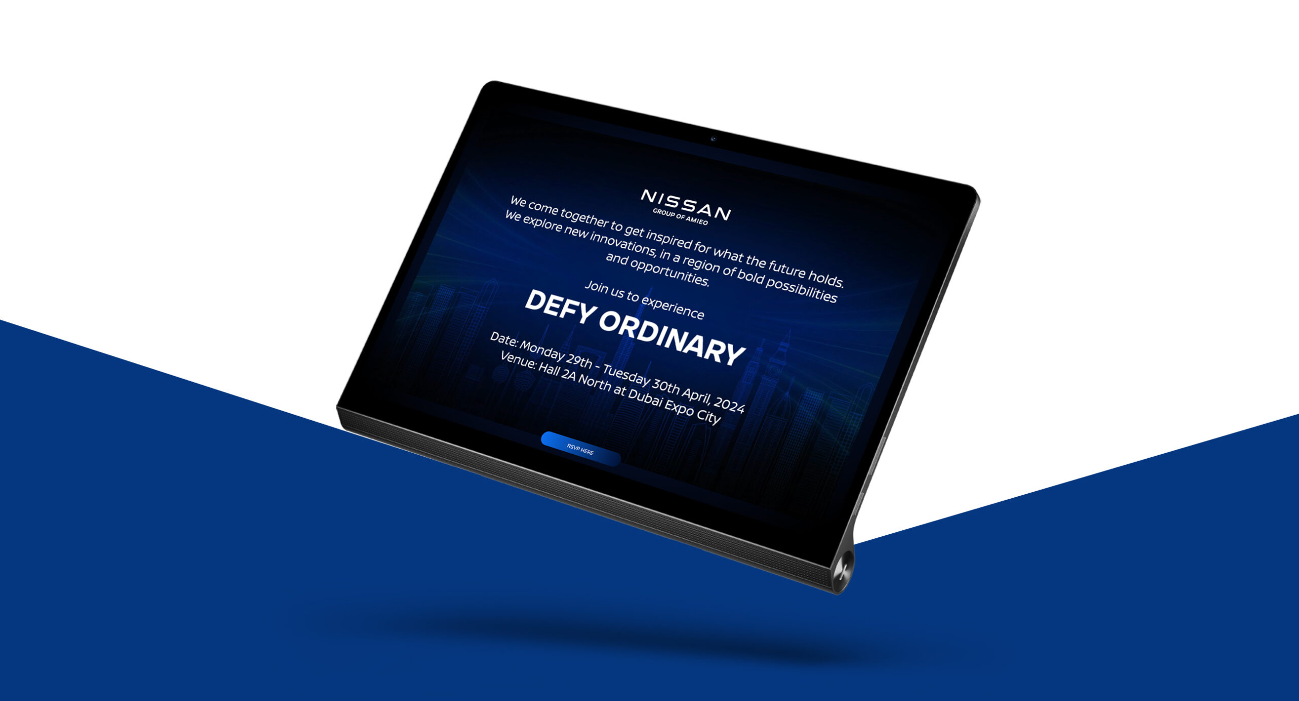
Adopt responsive web design – The layout of your website matters and contributes to user experience. The fixed design width approach and fluid web design that uses relative units and percentages based on the user’s screen size do not offer the best advantages; so you can adopt responsive web design. Here, you will get custom layouts across multiple devices.
RWD delivers a single HTML document to any device but applies different style sheets according to the screen size to optimize the layout for the given device.
Based on which device, a responsive web design layout provides great resolution and web pages that adapt to the screen size. For example, a responsive web design of your website on mobile and desktop provides a different experience. A desktop might have generic elements and menubars with a larger layout. The same responsive site will rearrange the content in a single column with augmented links to facilitate tapping if it is displayed on a smartphone.
Have a separate mobile website – Develop an independent website specifically for mobile screens. It is a common practice among businessmen due to the introduction of iPhones. These websites have separate URLs and provide a different content structure compared to desktop websites. Therefore, the two versions of the website deliver different experiences for people. Customised interfaces ensure richer experiences and a mobile website offers better features, performance, and navigation.
Progressive advancement – Progressive advancement is a design principle in web design that focuses on basic functionality accessible to users regardless of their browser capabilities and then progressively adds more advanced features and visual elements. Accessibility benefits, gradual enhancements, and focus on core content first are primary benefits.
Graceful degradation – First of all, Graceful degradation is a web design principle that you can follow. It allows your website functionalities to appear as it is even if some fail to load on time. It is widely used in many fields including web design. When you embrace a graceful degradation system in your web design, you can ensure the basic and peripheral functionalities for the end-user. It is also good if the user has no access to the latest web browsers.
The benefits of a website design for mobile
Mobile web design accentuates your SEO efforts – Having a mobile-first web design is vital to accentuate your SEO efforts. The ultimate aim of SEO is to increase your website rank on SERP results and user experience. Mobile-first indexing systems are recognized by Google and positively impact SERP ranking as it is a vital ranking factor. So, it is a must thing to do.
Reduced bounce rates – A well-designed website always captures the attention of the target regarding visual aspects and content. Such a web design impresses the user thus increasing dwell time and low bounce rates or not at all. People tend to explore your pages one by one immediately or at least they will skim through every page.
Mobile web design boosts conversions and engagement rates – Your target people have no intention of wasting their precious time on your website which loads slowly. So, the adoption of a mobile-first web design provides faster loading to find the apt information they require within a flick of time. This navigability and loading speed time increases conversion rate as well as engagement. Make your checkout process easier with catchy CTAs. Engagement rate spikes as they find spending time on your website does not feel boring or troublesome.
Mobile-first web designing increases your brand equity and perception – Increasing your brand equity and brand perception through an intuitive and responsive mobile web design. If your online storefront provides fast and accurate results, it will increase your brand perception. Target people consider your brand as a credible, trustworthy, and responsible business that meets their expectations in terms of services or products. At the same time, an unresponsive website design can perilously impact your business perception in the minds of the target audience.
Improved user experience – As we have seen, elevated user experience is the result of many factors. When you embrace a mobile-first web design, your website’s loading speed, conversion, engagement, and lead increase as a result your customer leaves the website with 100% user satisfaction. Besides, there is no disparity between desktop users as well as mobile users; because you are providing rich experience on both screen types.
Web designing agency in Dubai or similar companies engaged in digital marketing services can better offer a professional hand to embrace mobile web design. Mobile-first web design has become a necessity and once you know how to choose the right web design company, you can easily provide a stunning yet richer website experience for your target audience. A web design company with expertise and experience will have veteran people of diverse talents such as content writers, graphic designers, web designers, and testers to wire you the best mobile-first web design.
Related Post
Publications, Insights & News from GTECH