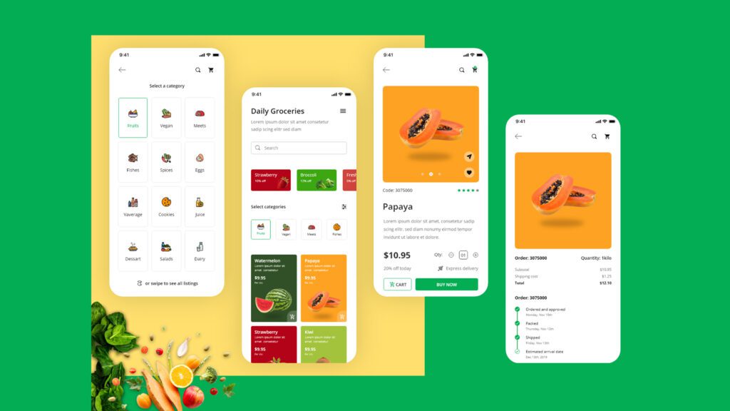
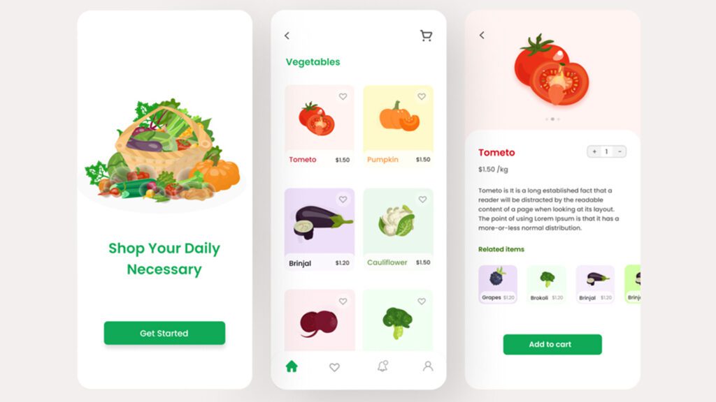
UI/UX design is reigning the software development as well as mobile applications as more businesses care about how the end-user feels about their product. Online grocery application is not an exception. There are several renowned online grocery businesses available in the digital world. If we are contemplating how well the current business of grocery is booming, the wide acceptance and expansion have many causes; namely, lifestyle changes and consumer habits. Moreover, the sudden surge of COVID-19 also forced many to go online to fill the food baskets at home.
All digital products are subject to usability and that’s where a user experience matters. Consumer attitude towards online shopping is always value for money. Understanding the expectations of online stores is becoming a challenge for online businesses. Thus to provide value, you need to have a stunning grocery app design. It can increase the convenience of online grocery shopping and is an effective tool to acquire more customers. In recent years, UX designers began to pay more attention to UI/UX design.

Grocery app Design and your business
It is vital to incorporate the best grocery app designs to capture the divergent minds of your target. UI and UX designers are in a b battle to retrieve the attention of the end user engagingly. They try to come up with unconventional ideas, design packages, color palates and others. Grocery online shopping is said to be the best experience for many as they can easily surf and turf within their comfort of home. The number of businesses and individuals buying groceries has increased to a large extent. The ideal grocery online app experience is determined by the quality of user experience. Grocery UI designs determine how a user feels about the visual interface.
A mobile application and website are some of the things required to function in an online grocery store. The advent of online grocery apps drastically changed the way we buy things and evaluate customer service. It is said to be that some startups introduced the idea of purchasing groceries online; e-groceries are of mainly three types;
- Inventory model
- Hyper-local model
- Mixed model
Grocery UI design for applications
Customer experience is a personal attitude. Different customers indeed have different expectations based on the customer’s understanding of a product and service. However, incorporating key features of UI/UX design assures your product stands out and performs the best for every user.
Why care for grocery UI designs
Customers pay attention to grocery UI when they come across your online application and it is up to you to provide a hassle-free user experience. Managing their busy lives is easy peasy with an effective online grocery store. They can select home delivery and make choices based on their convenience. The way you craft and deliver your online grocery shopping is vital. If you fail to provide the best UI/UX, you will considerably lose many prospects and end up satisfying existing customers’ needs with trouble and dissatisfaction.
Key features of any UI/UX designs
A grocery UI design like any other UI design is crafted based on several key principles and features. By adhering to these features in every design, the designer can come up with a responsive online grocery application. The creative process of organizing and presenting the whole information on a specific application will be more suitable than ever before. The business will be soon able to provide practical solutions to the headaches suffered by the end-user using poor user experience design.
Grocery apps UI/UX matters
User experience is achieved when a user prefers usability over desirability.
While designing an online grocery application, a designer considers these;
- Branding
- Design
- Usability
- Function
Grocery apps UI/UX must address the issues faced by the people to provide a hassle-free user experience. A successful online grocery application will be able to provide the following:
- Keep track of groceries
- Reminding grocery items
- Easy access and surfing of items in stock
- Automate sales and lend customer support
- Easy app navigation
- Return options
- Different kinds of online payments
- Deals and offers
- Reordering based on the previous list

To get the desired user experience, the online grocery application UI will be based on the following key principles:
- Easily accessible
The designs you incorporate in the website or any other digital product must be searchable for the end-user. Intensifying features and SEO if it is a website helps a lot.
- Hierarchy of information and design
Being a UI/UX designer, you must organize information in a manner that tracks natural eye movements. Size, font, alignment, contrast, proximity and repetition are some of the prominent elements you need to work on before designing anything. The hierarchy of information has to be correct so that the end-user can perform the action thus increasing conversion rates.
- Clear and concise
The end-user cannot lose focus and track when he visits your grocery application. Having too many intricate designs and buttons perplex them, so the design must be clear and concise. “ Less is more” is a good approach when it comes to designing an e-commerce application like an online grocery app.
- Responsive
Being responsive is the key to a successful online business. Nowadays, technology is expanding and anyone can access information from any smart device. Several conversion opportunities can be utilized if your application is responsive enough to amass them.
Conclusion
Putting the user at the centre of the design process is the ultimate key to a successful online business. By including the above principles while designing an application, you will be better able to reap some long-term benefits.
Related Post
Publications, Insights & News from GTECH


