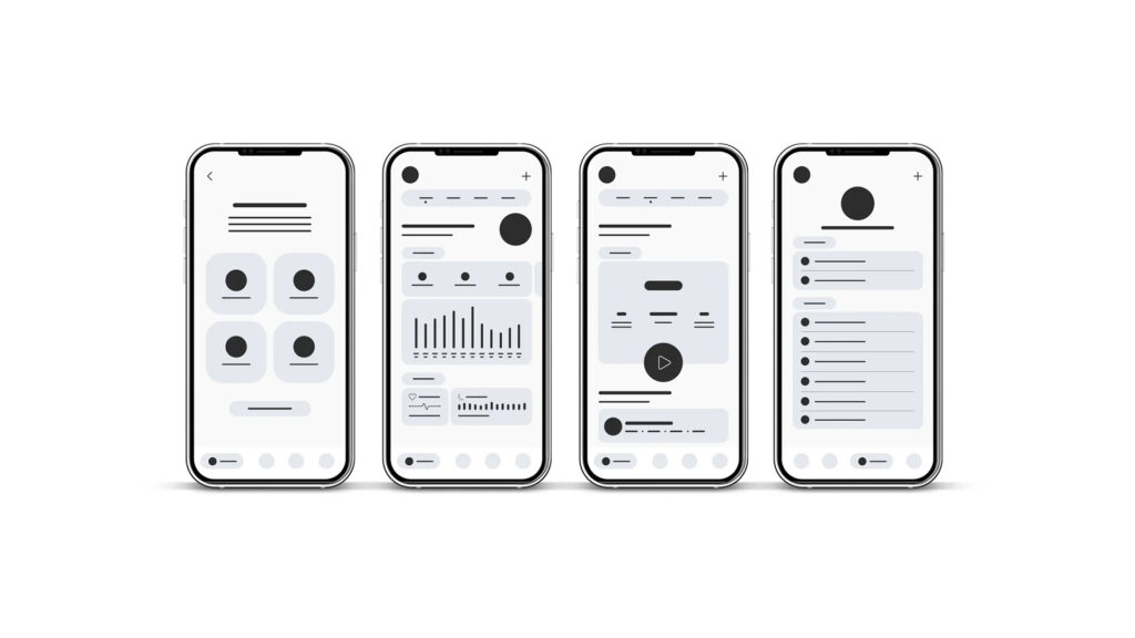
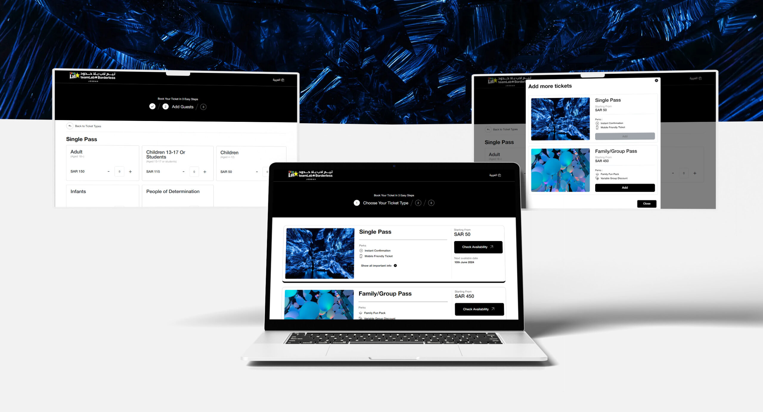
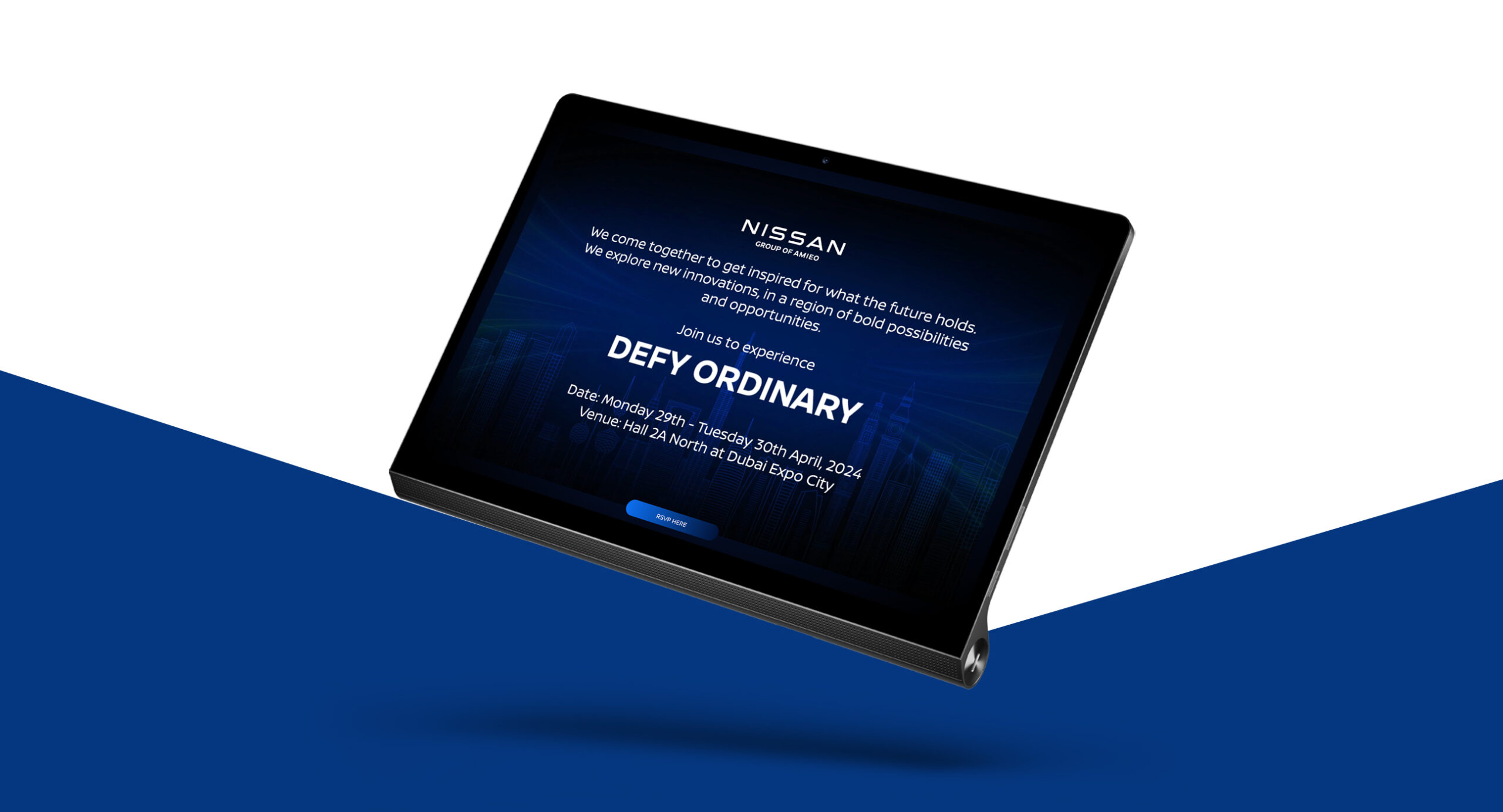
With more people using the internet via smartphones, having a website with a responsive design for mobile devices has become standard for almost every business looking to expand its online presence. Even though responsive design and seo websites are being developed and optimized for mobile devices, there are businesses whose company websites still fail to provide a user-friendly mobile viewing experience for their customers.
And what happens to those businesses in the long run? They lose traffic, miss out on the latest trends and eventually become less successful. If your website isn’t optimized or has a responsive design, we explain why you must switch to developing websites with responsive mobile design and why certain businesses miss out on this trend, let’s get started.
Importance of Responsive website design
The goal of responsive design and seo websites is to provide an optimal viewing experience for users across various devices such as desktop computers to smartphones and tablets. These websites achieve this result by adjusting their layout and content as per the size of the screen the content is displayed. Regardless of the device customers use, they can easily navigate and interact with the site
We know that mobile devices have become our primary means of communication, browsing the internet and more. In case you missed out, there are 4.32 billion mobile internet users in the world as of April 2023. This means that roughly half of the website traffic comes from mobile devices. Therefore, if your website doesn’t have a responsive design for mobile, you are missing out on a significant portion of your customers.

Why do most websites miss this trend?
Despite the growing popularity of responsive mobile design websites, many brands’ websites are missing out on this accessible feature and it has become a trend. What is the reason behind this? The thing is that mobile devices come in different screen sizes and customers have different requirements for websites when compared to desktop users. Easy navigation, faster loading, and presentation of information clearly and concisely are some of the most preferred needs. All these can be met with a website having a responsive design for mobile. But, there are some reasons why this trend is being missed, let’s check them out.
Lack of knowledge
Certain business owners may lack technical knowledge or understanding of responsive design best practice. For them, having a desktop website is sufficient without realizing that they are missing out on huge traffic in the long run.
Insufficient resources
Not every business or firm may have the resources needed to develop a responsive website. The primary reason behind insufficient resources is mostly budget. Due to this, business owners settle for a company website optimized for desktops only.

Prioritizing aesthetics over functionality
A visually stunning website is essential for your brand’s success but instead of just design, the whole website has to be user-friendly and optimized for mobile users if you want to achieve overall success and web traffic.
Building a responsive mobile design website
So, you decided to develop a mobile-friendly website on your own? Before you get started, you must know the two crucial factors that must be considered when developing websites with responsive web design which are Breakpoints & Visual content. By hiring our renowned website development services, you don’t have to worry about anything at all as our team will take care of everything.
Breakpoints are the “points” at which the particular website’s content will adapt to provide the best possible experience to the user. These points must be identified during the designing phase. Usually, three breakpoints are considered which are Smartphone/Mobile, Tablet and Desktop. Coming to visual content, include graphics such as images, videos, GIFs, etc. Since visuals can take a long time to load on mobile devices, they must be compressed and optimized for faster loading.
Best Practices for Responsive Mobile Websites
Mobile-First Design Approach
Well, if you want your website to be optimized for mobile, implementing a mobile-first design approach is the right responsive design best practice to get started. In this procedure, you start with the smallest screen size and then scale up to your largest screen. Consulting the services of a renowned web development team will prove helpful.
Use Scalar Vector Graphics
It is wise to choose Scalar Vector Graphics or SVG instead of raster graphics, especially for icons and logos. The thing about SVGs is that they can modify their resolution based on image paths thereby maintaining their visual quality on any screen size, unlike raster graphics.
Focus on a minimal approach
Like responsive websites, minimalist web designs are now highly preferred by various businesses. Implementing a minimal approach involves placement of less content thereby reducing cluttering and making it easier for users to read and understand the brand’s service clearly. Apart from the content, a minimalist UI design for your brand website makes it easier to create consistency across multiple devices having different screen sizes.
Prioritize & Hide Content Appropriately
The thing about mobile devices is that the amount of space available is limited. Therefore, when designing responsive mobile websites, you must decide which web content must be always visible and hidden. Using a navigation drawer can prove beneficial in this case.

Research Your Competitors
Want to learn the latest web design trends and stay ahead of the game? See what your competitors are doing. If you’re designing an eCommerce website, checking out the website of similar competitors and the strategies implemented by them will give you a brief idea. If they can come up with a responsive mobile design with their resources, what’s stopping you?
Conclusion
When it comes to performance improvement modules, lazy loading assumes a controversial approach. If there is a lot of imaginary inline on your site, it is a perfect opportunity to cut down on unnecessary downloads. The project stakeholders and the site users will appreciate it. Responsive design for mobile users is a highly preferred trend adopted by many businesses but often missed by a few. In today’s digital scenario, it is crucial to have a responsive mobile website to stay relevant and competitive. By developing such one, you can provide the best user experience for customers having multiple mobile devices, thereby increasing brand awareness. So, if you haven’t started it yet, connect with GTECH where we will build the best one that suits your brand well.
Related Post
Publications, Insights & News from GTECH


