The release of Yoast SEO has taken the world by storm. This release substantiates a new start in the art settings interface that takes SEO to the next level. The user interface of Yoast SEO WordPress is ahead of the curve and equips us with a bright future.
The new friend of SEO
With Yoast SEO, the focus is always on building Yoast SEO WordPress plugins. The features have been discussed first, though the experience has been ignored to a considerable degree. So, a new interface for Yoast SEO was long overdue.

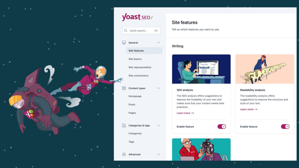
The Yoast 20.0 user interface eradicates the old method of making users click on multiple tabs to access pages with various choices. The new version of Yoast SEO for WordPress introduces a card-styled interface. This card interface does not require a user to make choices in the manner a tab interface does. The information is presented as a series of features that a user is able to turn on and off. It turns out that this is a simpler and more natural way to go about things.
Each category is represented by a row of cards that may be toggled on and off to reflect the settings. The structure of the page would replicate card-card-card. Every card that is a setting has an image at the top. Beneath the image, there is an explanation of the setting, and the footer is on and off in toggle mode. A Learn More button leads to a Yoast webpage that details that particular configuration.
When the setting is turned off, the image displays a grey shade. On the other hand, if the image has a shade, it means that the page is enabled. At a glance, a user can know which settings in any category are turned on and off by figuring out whether the card has a color or not. In fact, there is a micro view of the entire page settings that allows users to quickly overview things. This is something that is not possible in the old “click and scroll” way of doing things.
It is not that difficult to provide an interface with a new coat of paint, though rebuilding it would take a lot of time. This would mean rethinking what goes there, what we are looking to do in the future, and what this should look like. The best thing is that Yoast SEO for WordPress has been a success.

A better interface for all the stakeholders
A lot of work has gone into the formulation of a new setting UI for Yoast SEO Premium. For a lot of people, it would mean the end of an era and the emergence of a new feature. This new interface makes it easy to develop new features and improve Yoast SEO. In hindsight, it provides a new experience that would be a joy to use.
The CEO of Yoast SEO is really proud of what his team has developed in the Yoast SEO release. The team wanted to do this, and they went on to deliver. This works out to be a technically outstanding change, as it is on the way to optimizing and improving. On the other hand, the new interface goes on to reveal that they are providing the best experience for their users. Eventually, this promises to be an exciting step in 2023.
Yoast SEO 20.0: A logical structure for settings
The first thing that strikes me about the Yoast SEO plugin is that the interface is sleek, has streamlined navigation, and has a modern look. The new sidebar allows you quick and easy access to all the essential settings and features without navigating multiple menus or pages. A new search feature has been incorporated so you can find everything in a jiffy.
The four main sections are as follows:
General
- Site basics: Here you are going to come across the basic information related to your website, like the name and tagline of the website. In addition, the “plus force” rewrite options and the like also hold importance.
- Site features: From the various analyses to XTML site maps to the Index Now feature, you can toggle the features on and off here.
- Site connections: Here, you can connect different search engine tools to your website, like Bing Webmaster Tools and Google Search Console.
- Site representation: The section contains information about your website that enables search engines to understand it better via schema-structured data. For example, if the site represents an organization or a person, the name, logos, and social media accounts are all associated.
Content settings
- For each content type, you will find the site settings. You can determine how each of them would appear in search and how it is going to look on social media. In addition, the types of schema data that describe the content best are also illustrated.
Categories and tags
- It is the same as the content types, except this is for the taxonomies.

Advanced
- Here you are likely to come across features like crawl optimization in Yoast SEO Premium. Apart from that, the settings for various archives, breadcrumb options, and special pages are important.
Individual feature settings pages
A major change in Yoast SEO Premium is the new, intuitive layout of all the individual page settings. Every setting now has a clear and concise explanation that makes it easy to understand how and why to use it. This new interface also includes helpful links to help you better understand how to optimize your website for search engines. For all those who are new to SEO, this works out to be a user-friendly feature.
To conclude Yoast SEO, WordPress is a major step in developing the plugin, and the general feeling is that it would enable you to achieve your SEO goals easily. The new interface is user-friendly, intuitive, and cleaner. For search engines, it is easier to optimize your website. A suggestion is to start using the new interface and seeing the results for yourself.
For more such blogs, visit GTECH, a top search engine optimization agency in Dubai.
Related Post
Publications, Insights & News from GTECH


